Graphics Feedback 1/6/2013
Here is some feedback about the initial character sprites. Overall I think you have come up with the perfect style for the graphics! I think they really look like they could have come from an old game which is great.
I have cut all of the sprites out and put them into my game, and I think there are a few things that don't quite look right.
Character Sprite
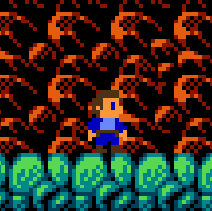
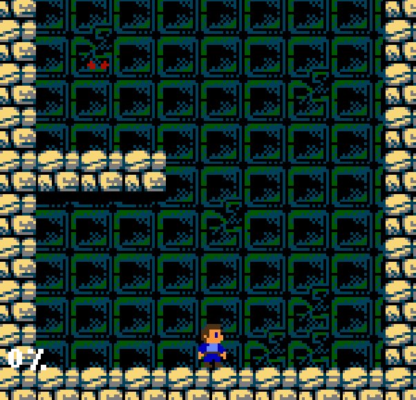
I like the style of the main character, but I don't think the colours work very well with the game backgrounds. First of all the colour of his hair and boots blends in a lot with the background in the first section, as you can see in this image:
The second issue I have with the colours is that maybe the blue on his jacket and trousers is a little bit too dark. I'm not sure what to suggest for this though - maybe it will look better once the other colours are changed.
The third thing is that the sprite is a little bit small and skinny. The width of the sprite is very small and the 1 pixel gap between the legs makes it hard to see his legs properly. If you look at the mario sprite below you can see that the sprite is a bit chunkier, and that he has a bigger gap between his legs which make it easier to pick out his legs from the background:
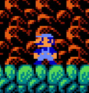
He obviously doesn't need to look like mario with just the face changed though! I think this could be the hardest sprite to get right.
Dungeon Section
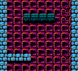
I think I will probably change the colours of the background for the dungeon section. First, here is a picture of the old colours:
Here is a picture of some colours I might use instead (I'm not 100% sure yet but it would probably be similar to this):
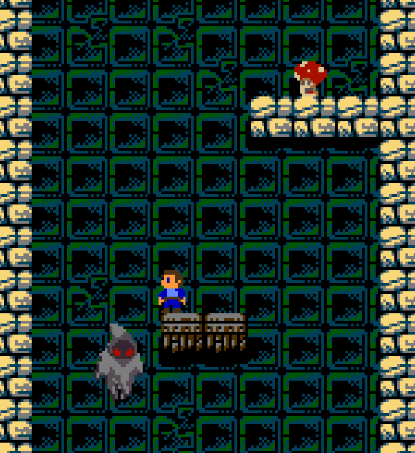
The mushroom sprite looks awesome! (Although I cut his legs off by accident!)
I'm not so happy with the ghost sprite now that I've seen it in the game. I like the face / head, but I'm not so keen on the body. I think it might be the detail at the bottom of the sprite that I I don't like, and the body could possibly be a bit bigger but I'm not sure. It might also be because when the sprite moves around it is not animated (i.e. maybe the bottom part should move like blowing in a breeze?). I'm not sure what the best thing to do with this sprite is - any suggestions would be welcomed!
Also, now that I have changed the background colour the eye colour on the ghost is perfect!
Moon Section
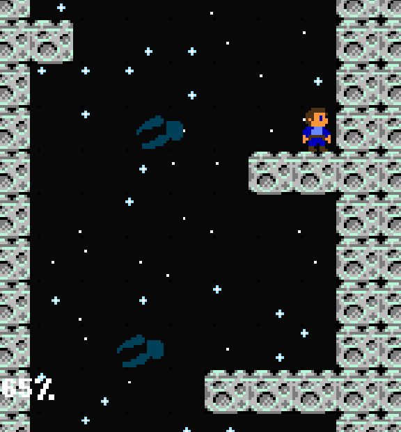
Out of all of the sprites, the claws are the thing I am least happy with. First of all the colours don't really work against the black background. You can see in this image that it is very hard to make them out and to see the shading:
I also don't particularly like the look of them in general. They are very similar to the claws in my prototype, but they don't need to be the same colour or shape at all! I only used those colours because that was the best image I could find.
To give you a better idea of how they work in game I'll describe how they move:
- They start with their back against the wall (right hand side in the screenshot)
- After about a second they shoot quickly all the way across the playing field (to the left in the screen shot)
- They wait there for another second
- They slowly return to the starting position
Let me know if you want me to send you a dev build of the game so that you can see this.
The spikey red ball and the floating eyes look great though!
Pyramid Section
The beetle is the right kind of thing, but again the colours don't really work well against the background:
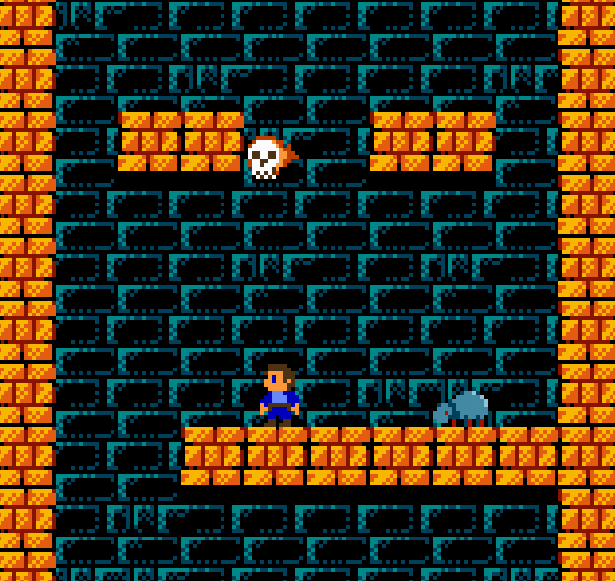
This image also has a picture of a flaming skill. I think the skull itself looks amazing! I love the cartoony style of it. The thing I'm not so keen on here is flame coming off the side of it. The colours and the style are fine, but I think the flame needs to go upwards more instead of coming so much from the side. These skulls move relatively slowly in all directions, so it looks odd when the skull is moving downwards slowly with flames coming from the right.
As I said in an earlier email I didn't like the spinner sprite either - it needs to be a bit larger.